Note-It Mobile App
A note-taking app for you to organize your doctor appointments.
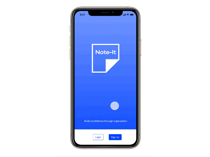
Here is a prototype tour of the final product.

Overview
When was the last time you went to the doctor?
A doctor’s appointment can be a taxing experience. A visit to the doctor is expensive and you want to make sure you are maximizing your time and efforts. Remembering the dates, progression of symptoms, and other specific information about an appointment can be difficult to do on the spot.
Problem
Sara is a busy high-school teacher who needs to efficiently and confidently keep track of her doctor’s visits in order to figure out her ailing health concerns.
Discovery Research Phase
Role
Developed a project scope of work for my self-defined project scope. Phases would include discovery research, information architecture, wireframes, low-fidelity, and high-fidelity prototypes, and a final presentation.
Research methods included:
SMS and email surveys with potential users.
Directed Storytelling sessions with 4 people who frequently have doctor’s appointments.
Competitive Analysis of note-taking tools in both analog and digital formats.
Compiled data synthesis to create an affinity diagram of common note-taking themes, preferred feature integrations, digital applications.
In-progress shot of Comparative Analysis and Project Scope
Survey Results Synthesized
Affinity Diagram of Directed Storytelling Sessions
Information Architecture Phase
User Journey Map
Establishing a journey map was an important step for me to start visualizing the various touchpoints and feelings a user would experience during a doctor’s appointment.
Important Steps in the process included:
Initial consultation with a new doctor
Additional appointments to keep track of
Doctor notes about the plan and eventual diagnosis
Keeping track of the notes
Recalling the note at the doctor’s appointment
Staying organized beyond doctor’s appointments
User Task Flow and Site Map
Created flow charts to establish user paths through the application. Tasks included signing up as a new user, adding notes to a doctor's appointment, and recalling a note at the doctor.
Tools I used included:
Miro Boards
InVision Freehand
Post-It notes
New doctor consultation appointment
Using the mobile app to add other appointments to dashboard
Site flow for recalling a note
Writing out Journey Map steps
A site flow for the mobile application
Hand Sketching & Low-Fidelity Prototyping Phase
Wireframing Feature Ideas
Sketches focused on creating an easy to navigate dashboard for quickly recalling a note.
Emphasized the use of icons to be consistent with other calendar and note applications.
I wanted the user to be able to quickly make a note or recall a note.
Usability sessions were conducted to receive feedback on navigation, appointment card modal, and the creation of a new note.


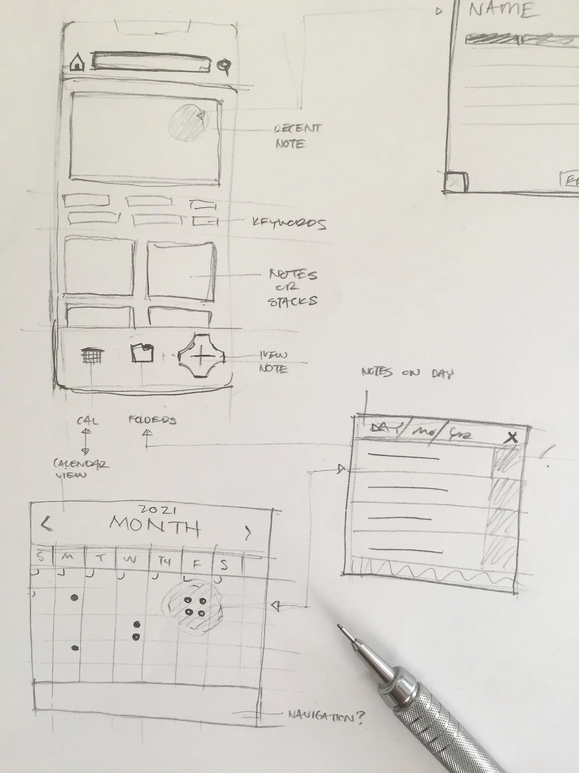
Wireframes for onboarding process and adding a new note
Interactive Prototype Phase
High Fidelity Prototype made in Figma. Created a “happy-path” to showcase some of the key features of the demo.
Demo included the sign-up and onboarding process of syncing your calendar.
First appointment is already on the calendar.
Add a question to the existing appointment.
Add a photo scan of the notes provided by the doctor.
Change label of note.
At the day of the appointment, open note and read the question verbatim. There is also an additional note added to the appointment card.
After appointment the app has been updated with more notes for other appointments.
Demo Tour of Prototype
Challenges of Project
The toughest challenge I overcame with this project was maintaining the simplicity of connecting notes to an appointment. Learning a new system can be a challenge for people. To effectively make that a smooth transition with this application became a great challenge
By keeping the app simple and open to self-discovery, users would be able to make this app work for them.
Accessibility Review
The prototype was reviewed by an accessibility consultant. Their findings will be used to further iterate the prototype to be more accessible.
Areas of improvement would include:
Button consistency across pages
Label icons with text
Adjust “x” on modals to improve usability
Improve contrast with blue color scheme by adding a secondary color
Lessons Learned
This project was a great opportunity to be the lead designer on a new product design. Uncovering a problem with how people manage their doctor appointment notes and building an easy to use solution was a great challenge. I learned about how important it is to frame your questions as to not make validated assumptions when conducting primary research. I would of improved the phrasing of my initial survey questions to discover more about how a high volume appointment maker would interact with a doctor.
Also during the development of the prototype I would of liked to have iterated more quickly in the beginning of the prototype process. I think by having a prototype in the hands of users earlier in the process, I would received more feedback on how to improve the intuitive nature of the design. Overall, the project was a great learning opportunity and an exciting prototype to develop.